双飞翼界面布局与圣杯布局
已被阅读 2326 次 | 文章分类:html | 2018-02-25 22:01
都是通过float:left布局的三栏布局,两边的盒子宽度固定,中间盒子自适应。唯一不同就是,圣杯布局设置中间div的padding来避免中间div内容被遮挡,双飞翼在中间div内再增加一个div,设置内层div的margin来避免中间div内容被遮挡
一:关键原理
双飞翼布局设置三个盒子的float属性为left,设置了float属性的元素,可以覆盖在其他元素上面;然后在中间的盒子中再内置一个content的div,设置该div的margin边距属性,来防止左右两个盒子遮挡中间盒子内容;
二:代码实例
<!DOCTYPE html>
 <html xmlns="http://www.w3.org/1999/xhtml">
 <head>
  <meta http-equiv="Content-Type" content="text/html; charset=utf-8"/>
  <title>双飞翼布局</title>
  <style>
      html, body {
          margin:0;
          padding:0;
      }
      .Middle {
          float:left;
          width:100%;     /*Middle div的宽度一直充满整个屏幕*/
          height:100%;
      }
      .MiddleContent {
          margin:0 300px 0 200px;
      }
      .left {
         float:left;
         width:100px;
         margin-left:-100%;
         height:100%;
         background-color:red;
      }
      .right {
          float:left;
          width:200px;
          margin-left:-200px;
          height:100%;
          background-color:green;
      }
      .main {
          height:300px;
      }
      header{width: 100%;height: 60px;background-color: darkseagreen;}
      footer{width: 100%;height: 60px;background-color: darkseagreen;}
  </style>
 </head>
<body>
    <header>header内容区</header>
    <div class="main">
        <div class="Middle">
            <div class="MiddleContent">
               middlecontent
            </div>
        </div>
        <div class="left">
            left
        </div>
        <div class="right">
            right
        </div>
    </div>
    <footer>footer内容区</footer>
</body>
</html>
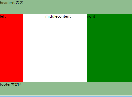
三:布局效果
四:圣杯布局
1. div布局
<div id="hd">header</div>
    <div id="bd">
      <div id="middle">middle</div>
      <div id="left">left</div>
      <div id="right">right</div>
    </div>
    <div id="footer">footer</div>
    <h1>welcome to xiaobai</h1>
2. 样式文件,最后实现效果是一样的
#hd {
  height: 50px;
  background: #666;
}
#bd {
  /*左右栏通过添加负的margin放到正确的位置了,此段代码是为了摆正中间栏的位置*/
  padding: 0 200px 0 180px;
  height: 100px;
}
#middle {
  float: left;
  width: 100%; /*左栏上去到第一行*/
  height: 100px;
  background: blue;
}
#left {
  float: left;
  width: 180px;
  height: 100px;
  margin-left: -100%;
  background: #0c9;
  /*因为设置了包裹他们的外层div的padding;所以将左右div分别往外拉一拉  */
  position: relative;
  left: -180px;
}
#right {
  float: left;
  width: 200px;
  height: 100px;
  margin-left: -200px;
  background: #0c9;
  position: relative;
  right: -200px;
}
#footer {
  height: 50px;
  background: #666;
  text-align: center;
}
上一篇:DOM事件冒泡机制以及阻止原理
下一篇:简单的响应式布局原理